
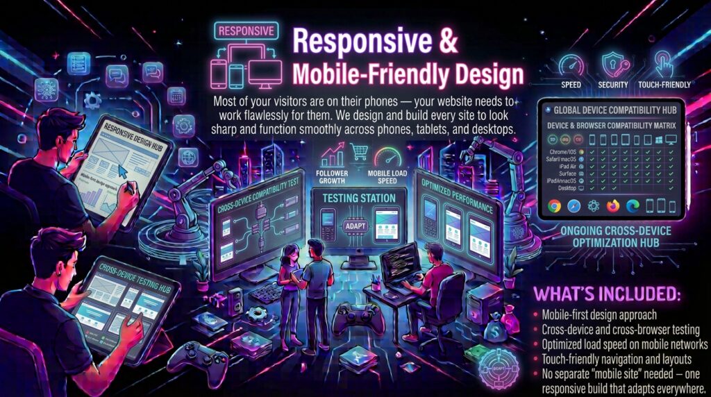
Mobile-First Engineering from Initial Wireframe
Desktop-first design is dead.
Over seventy percent of your prospective buyers browse your website from mobile devices on cellular connections. Taking a heavy desktop layout and squeezing it down with CSS media queries produces awkward font sizes, buttons too small to tap accurately, and massive asset payloads that crawl over mobile data. We design for phones first.
We build responsive interfaces from the mobile view up. Every component adapts gracefully across smartphones, tablets, laptops, and ultra-wide desktop monitors, dynamically swapping image assets, restructuring data tables, and adjusting touch targets to match device hardware capabilities.
Responsive Architecture Specifications
- Dynamic Asset Delivery: Serving next-generation AVIF and WebP image formats scaled automatically to the user exact screen pixel density.
- Ergonomic Touch Targets: Forty-eight-pixel minimum interactive tap targets designed specifically for one-handed mobile navigation.
- Device Testing Lab: Automated cross-browser test suites covering iOS Safari, Android Chrome, Samsung Internet, and modern desktop engines.
Deliver a responsive mobile experience with TechnologyBae. Reach out on our Contact Us page.